Prop-driven React styles justify the extra abstraction
A button whose appearance follows React props is a good reason to consider styled-components. The library keeps CSS beside the component, generates scoped class names, and lets a style read props or a shared theme. You can extend a base component for a visual variant without moving its styling into a separate naming convention. That fits a design system with reusable primitives better than a page whose CSS hardly changes.
The 6.6.0 README shows a transient $primary prop that affects styling without reaching the DOM. It also shows changing the rendered element with as and styling another component that accepts className. Those details matter when designing your own component API: a visual variant should not accidentally become an HTML attribute, and a link still needs link semantics even when it looks like a button.
What happened when we ran it
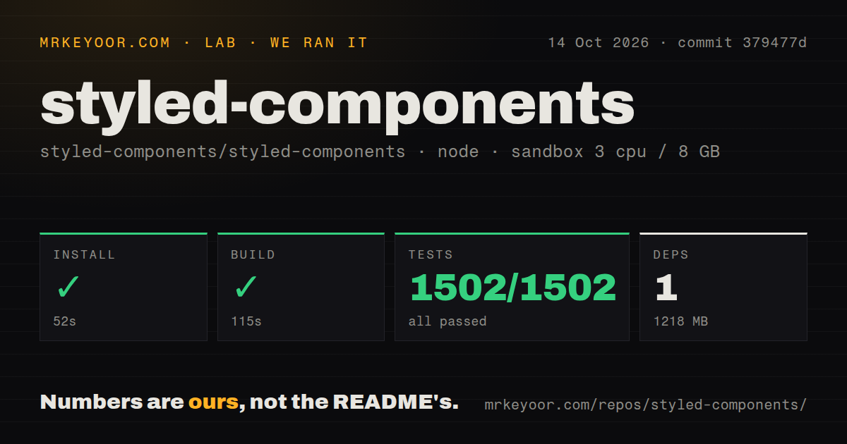
Our styled-components run built in 115 seconds and passed all 1,502 tests. The October 14, 2026 run used commit 379477d; pnpm installation succeeded in 52 seconds, recording 1 dependency and 1,218 MB on disk. The test step succeeded in 47 seconds, with Jest reporting 1,502 passed and 0 failed out of 1,502. This is evidence that the measured repository commands completed cleanly for that checkout.
The recorded sandbox configuration specified 3 CPUs, 8 GB of RAM, and image lab-node:22. The label does not prove the actual Node.js or operating-system version. Our scan counted 783 files, about 131,397 source lines, and a 9.1 MB checkout. It found 4 CI workflow files, monorepo workspaces, no Dockerfile, and no tests directory. A directory scan alone cannot establish where the passing Jest cases live.
The 1 recorded dependency and 1,218 MB footprint are separate measurements. We cannot turn that record into a complete transitive dependency count. Nor is the contributor checkout's disk use a browser download size. No vulnerability-audit result was supplied, and these commands did not measure application rendering speed, hydration behavior, or the cost of dynamic styles. A clean library suite earns an application trial, not automatic deployment approval.
Version 6.6.0 requires Node.js for server rendering
The 6.6.0 release notes tell routes rendering styled-components to use the Node.js runtime. Edge rendering now receives a clear error naming that requirement. If your architecture requires edge-only server routes, this is a reason to choose another styling approach before adopting the library. A broad promise of server support should always be read alongside the runtime it supports.
That release also documents fixes for styles disappearing around Suspense boundaries and global styles disappearing during streaming or navigation. These are upstream fixes, not failures observed in our sandbox. They suggest useful application checks: reveal content after a fallback, navigate between routes that share global styles, and verify the resulting CSS remains present. The recorded run does not identify its relationship to the release tag, so its green suite does not certify that published artifact.
Theme tokens and wrappers need an explicit contract
ThemeProvider supplies theme values to styled components, while reusable css fragments let several components share rules. For a component library, decide which values belong in the theme and which belong in ordinary props before wrapping every element. Otherwise a caller may need to understand both the component's behavior and an undocumented styling interface just to adjust spacing. The library provides the mechanisms; your design system still needs to define the conventions.
Version 6.6.0 also corrected attrs behavior when callers explicitly supply undefined. Its notes warn that wrapped components may behave differently when that prop is forwarded again. Audit wrappers that spread props and rely on defaults, especially around another UI library. A targeted upgrade check should inspect the actual rendered attributes and interactions. Replacing a visible style snapshot alone would miss a default button type or another behavioral attribute changing underneath it.
One main maintainer is a dependency decision
The README says styled-components is largely maintained by one person. GitHub recorded a last push on October 19, 2026, with 25 open issues and PRs. The recently updated queue included both fixes and reports that day, and the latest release was published October 12. Those observations show ongoing work. They do not establish a support response time or make maintainer concentration disappear.
An organization requiring several maintainers for a core UI dependency has a concrete reason to decline it. An existing React team may reasonably choose to fund the project and maintain its own upgrade checks instead. We have not measured response quality, adoption, or production reliability, so those dimensions remain unscored. The useful evidence here is the current activity alongside the maintainer's own statement about who carries the work.
Emotion and vanilla-extract offer different styling contracts
Emotion's README offers string or object styles, with a CSS prop example and links to its styled API. Compare it when your team wants that choice of authoring interfaces. This assessment contains no matched Emotion run, so choosing it for a speed advantage would outrun our evidence. Compare the way callers express variants and compose styles instead.
vanilla-extract writes styles in TypeScript and generates static CSS at build time. It is the more relevant alternative when generating CSS during the build is a requirement and scoped class names plus CSS variables cover the job. For styled-components, trial one representative themed component on the exact release you intend to ship, including its server route and wrappers. The decisive check is whether that component survives your application's rendering path with the attributes and styles you intended.