storybook review
Storybook 10.5.10 is a separate development and build environment for rendering UI components in named states. Stories become a searchable catalog with editable args, generated docs, accessibility checks, and interaction tests driven by play functions. Framework adapters reproduce enough of React, Angular, Vue, Svelte, web components, and other application environments to render components without launching the whole product. The current patch fixes snapshot paths, TypeScript aliases in solution-style projects, React union-prop metadata, and a Vitest dependency linked to CVE-2026-47428. Our direct import probes failed, confirming that the root package is tooling rather than application code.
Storybook 10.5.10 took 24.3 seconds to install 75 packages using 58 MB, and both root import probes plus browser bundling failed in our sandbox because this is a Node toolchain, not runtime code. That cost pays off for shared component catalogs and UI review; a small app needing only tests should stay with Vitest or its existing runner.
We installed it
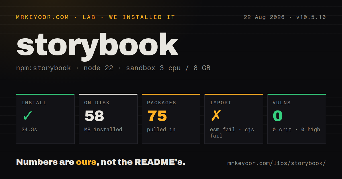
| Install | ✓ · 24.3s | 75 packages on disk · 58 MB |
| Import | ✗ | ESM import fails · require() fails · ESM package with exports map |
| Browser | n/a | could not be bundled for the browser (Node-only code, most likely) |
| Types | — | no TypeScript types found |
| Known vulns | 0 | 0 critical · 0 high · 0 moderate · 0 low (npm audit) |
Answers from our run
Does storybook install cleanly?
Yes. In a fresh container with an empty cache, npm install storybook finished in 24 seconds, leaving 75 packages and 58 MB on disk. npm audit reported no known vulnerabilities.
Can storybook run in a browser?
Not directly: esbuild could not bundle it for the browser in our run, which normally means it depends on Node built-ins. Use it on the server, or find a browser-targeted alternative.
Does storybook work with both ESM and CommonJS?
Neither plain import nor require succeeded in our sandbox, so it needs a bundler or extra setup.
Does storybook include TypeScript types?
No type declarations were found in our install, so TypeScript users need their own declarations.
storybook or @ladle/react: which should you use?
@ladle/react: Choose it for a narrower React and Vite workshop where Storybook's addon system is unnecessary. Storybook 10.5.10 took 24.3 seconds to install 75 packages using 58 MB, and both root import probes plus browser bundling failed in our sandbox because this is a Node toolchain, not runtime code.
When should you not use storybook?
The product has only a handful of local components and no review audience. Stories would duplicate tests and examples without a catalog benefit.
Use it if
- A shared design system needs searchable examples, editable args, and usage pages for each component state.
- QA and developers want interaction tests against isolated rendered components rather than full product navigation.
- CI should publish a static UI catalog for design review and visual-diff services.
- The chosen framework is officially supported and story maintenance is part of component changes.
- The product has only a handful of local components and no review audience. Stories would duplicate tests and examples without a catalog benefit.
- Only component logic needs testing. Vitest plus Testing Library avoids another server, configuration graph, and 58 MB base install.
- Application aliases, transforms, providers, or runtime environment cannot be reproduced inside Storybook's separate builder.
- Code intends to import the package root at runtime. Both require and import failed in our Node 22.23.2 probes.
- Core, framework adapter, and addon versions cannot be upgraded together through majors and their codemods.
Setup reality
We installed Storybook 10.5.10 in a clean Node 22 Bookworm sandbox. npm took 24.3 seconds and left 75 packages using 58 MB. The root package is 21,512 KB unpacked with 17 direct dependencies and 3 peers; npm audit found 0 known vulnerabilities. It declares ESM and an exports map, yet both require() and ESM import failed on Node.js 22.23.2. The log identified that Node version but no narrower cause. We found no package-level TypeScript types, and esbuild could not make a browser bundle.
Run npx storybook@latest init inside the application workspace so detection chooses a framework package and creates .storybook/main plus preview configuration. Keep core, framework, and addon versions together through Storybook's upgrade command. This builder has its own module graph, so aliases, CSS transforms, static directories, environment variables, and framework plugins that work in the product may need parallel setup.
main.ts controls story globs, addons, framework, and builder behavior. preview.ts is where global decorators and parameters provide routing, state, themes, or internationalization. Missing providers often produce a blank or misleading story instead of a setup error. Any value exposed to preview code or a static Storybook is public, so use mocks or disposable backends and never embed a secret.
CSF stories are exports, and a play function operates within its rendered canvas. In version 10, test helpers come from storybook/test; older @storybook/test snippets can be wrong. Run storybook build in CI because the application's successful build says nothing about this separate graph. A big story catalog also increases CI time, so cache dependencies and tag or split interaction runs where the runner permits it.
Patterns
Initialize from the component workspace initialize-project
npx storybook@latest init
npm run storybook
Framework detection reads the current workspace. In a monorepo, run it where the components and application config live.
Declare typed story metadata write-basic-story
import type { Meta, StoryObj } from '@storybook/react-vite';
import { Button } from './Button';

const meta = { component: Button, title: 'UI/Button' } satisfies Meta<typeof Button>;
export default meta;
type Story = StoryObj<typeof meta>;
export const Primary: Story = { args: { children: 'Save', variant: 'primary' } };
`Meta` and `StoryObj` should come from the installed version 10 framework adapter, not an older renderer package.
Derive an error state from defaults reuse-story-args
export const Disabled: Story = {
  args: { ...Primary.args, disabled: true },
};
Each named export becomes a catalog entry. Spreading base args keeps related examples synchronized.
Override one inferred control configure-controls
const meta = {
  component: Button,
  argTypes: {
    variant: { control: 'select', options: ['primary', 'secondary', 'ghost'] },
  },
} satisfies Meta<typeof Button>;
ArgTypes should correct a bad inference or add useful labels, not duplicate every component property manually.
Wrap a story in its provider add-provider
const meta = {
  component: AccountMenu,
  decorators: [Story => <MemoryRouter><ThemeProvider><Story /></ThemeProvider></MemoryRouter>],
} satisfies Meta<typeof AccountMenu>;
A provider shared by most files belongs in `preview.ts`; keep this local when only one story family needs it.
Test interaction inside the canvas test-interaction
import { expect, fn, userEvent, within } from 'storybook/test';

export const Submit: Story = {
  args: { onSubmit: fn() },
  play: async ({ canvasElement, args }) => {
    const canvas = within(canvasElement);
    await userEvent.click(canvas.getByRole('button', { name: 'Save' }));
    await expect(args.onSubmit).toHaveBeenCalledOnce();
  },
};
Version 10 exports these helpers from `storybook/test`. Imports from `@storybook/test` belong to older guidance.
Turn on automatic component docs enable-autodocs
const meta = {
  component: Button,
  tags: ['autodocs'],
} satisfies Meta<typeof Button>;
The framework's docgen step supplies prop tables, so opaque wrappers or unreadable types can leave the table incomplete.
Set viewport and action defaults set-global-preview
import type { Preview } from '@storybook/react-vite';

const preview: Preview = {
  parameters: { layout: 'centered' },
  decorators: [Story => <AppProviders><Story /></AppProviders>],
};
export default preview;
Preview parameters affect rendered stories. Framework selection and addon installation remain in `main.ts`.
Copy public assets into the catalog serve-static-files
// .storybook/main.ts
export default {
  stories: ['../src/**/*.stories.@(ts|tsx)'],
  staticDirs: ['../public'],
};
The application build does not supply this static site. `staticDirs` must include every referenced asset directory.
Mock a story's network response mock-network
export const Loaded: Story = {
  parameters: {
    msw: { handlers: [http.get('/api/profile', () => HttpResponse.json({ name: 'Ada' }))] },
  },
};
Handlers take effect only after the MSW addon and its preview loader are configured globally.
Build the static review site build-static-site
npx storybook buildOutput defaults to `storybook-static`. Validate its warnings and assets independently from the product's successful build.
Upgrade aligned Storybook packages upgrade-all-packages
npx storybook@latest upgradeThe upgrade tool coordinates package versions and codemods. Inspect every generated configuration edit before merging it.
Alternatives
| Package | Registry | Pick it when |
|---|---|---|
| @ladle/react | npm | Choose it for a narrower React and Vite workshop where Storybook's addon system is unnecessary. |
| histoire | npm | Choose it for Vue or Svelte teams that want stories built directly around Vite conventions. |
| react-cosmos | npm | Choose it when React fixtures matter more than generated documentation or a large addon catalog. |
More testing guides
pytest · chai · vitest · jsdom · playwright · coverage · the whole shelf →
How this guide is made: grounded in the library's documentation, release notes, changelog, and issue history, on a fixed rubric — not a hands-on install of every release. The 50 most-downloaded entries are additionally install-verified in clean containers. Corrections: contact the desk.