css-mediaquery review
css-mediaquery 0.1.2 parses old-style CSS3 media queries and evaluates them against a device-state object supplied by your code. Its two exports are `parse()` and `match()`. The package is useful in SSR tests where `window.matchMedia` does not exist, but it cannot observe a viewport or emit change events. Our complete browser build was only 2.3 KB minified and 1.1 KB gzipped. There is no newer release to explain: 0.1.2 was published in January 2014, before range syntax and media features such as `prefers-reduced-motion` became ordinary application requirements.
css-mediaquery 0.1.2 installed in 0.7 seconds and bundled to 1.1 KB gzipped in our sandbox, but its last npm release was in 2014. Keep it for compatible CSS3-era SSR tests; do not install it to validate modern browser media queries.
We installed it
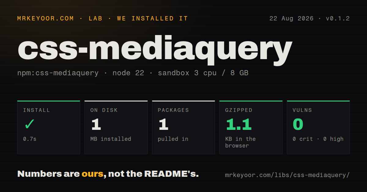
| Install | ✓ · 0.7s | 1 package on disk · 1 MB |
| Import | ✓ | ESM import works · require() works · CommonJS package |
| Browser | 1.1 KB | gzipped (2.3 KB minified), bundled with esbuild |
| Types | — | no TypeScript types found |
| Known vulns | 0 | 0 critical · 0 high · 0 moderate · 0 low (npm audit) |
Answers from our run
Does css-mediaquery install cleanly?
Yes. In a fresh container with an empty cache, npm install css-mediaquery finished in 0.7s, leaving 1 package and 1 MB on disk. npm audit reported no known vulnerabilities.
How much does css-mediaquery add to a browser bundle?
1.1 KB gzipped (2.3 KB minified) when the whole package is bundled for the browser with esbuild. Importing only part of it is usually smaller.
Does css-mediaquery work with both ESM and CommonJS?
Yes. Both import 'css-mediaquery' and require('css-mediaquery') worked in Node 22 in our run. The package is published as CommonJS.
Does css-mediaquery include TypeScript types?
No type declarations were found in our install, so TypeScript users need their own declarations.
css-mediaquery or media-query-parser: which should you use?
media-query-parser: Use it when parsing current media-query text matters more than evaluating a fake device state. css-mediaquery 0.1.2 installed in 0.7 seconds and bundled to 1.1 KB gzipped in our sandbox, but its last npm release was in 2014.
When should you not use css-mediaquery?
Your queries include prefers-reduced-motion, any-pointer, color-gamut, or modern comparison syntax; open requests show these gaps
Use it if
- You need the established `match(query, values)` contract inside an older SSR or test dependency
- Your inputs use Media Queries Level 3 forms such as min-width, orientation, resolution, and comma-separated alternatives
- A small package-specific AST is sufficient for inspecting one media-query string
- You can define the simulated media type and every feature value explicitly
- Your queries include `prefers-reduced-motion`, `any-pointer`, `color-gamut`, or modern comparison syntax; open requests show these gaps
- You need browser-faithful relative units because the implementation fixes em and rem at 16px
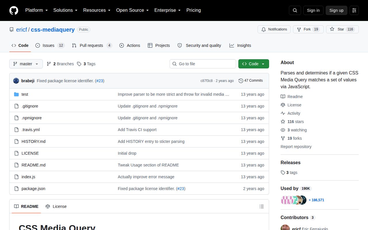
- You need active releases: npm 0.1.2 dates to 2014, while the 2024 repository update did not produce a package release
- Your TypeScript project requires declarations from each dependency; our install found none
- You need repeated evaluation of a parsed AST because public `match()` accepts a string and parses it again on every call
Setup reality
Our install of css-mediaquery 0.1.2 completed in 0.7 seconds. It left 1 package and 1 MB on disk; the tarball expands to 32 KB and declares 0 direct dependencies and 0 peers. npm audit found 0 known vulnerabilities. The BSD package is CommonJS without an exports map. require() and ESM import both worked, but no TypeScript declarations were present.
There are no credentials, native builds, or configuration files. Call match(query, values) with a concrete type such as screen or print; the README says type is required and cannot be all. The values object is synthetic. Node does not fill width, resolution, color depth, or orientation for you.
Our namespace browser build measured 2.3 KB minified and 1.1 KB gzipped. That low cost does not make the result browser-equivalent. The code treats em and rem as 16px, has reported problems around zero values and calc(), and only understands the grammar it ships. parse() can throw SyntaxError, and match() calls it internally, so untrusted query strings need an error boundary.
The AST contains query objects with inverse, type, and expression records. There is no public serializer, listener API, or match-from-AST method. An SSR guess of 1,024px can disagree with the client during hydration. Keep that policy visible in tests, and use the real window.matchMedia after the browser owns the page.
Patterns
Evaluate a minimum width match-width
const mq = require('css-mediaquery')

const matches = mq.match('screen and (min-width: 40em)', {
  type: 'screen',
  width: '1024px',
})
The 40em threshold becomes 640px because this package always treats 1em as 16px.
Accept either screen width or print match-query-list
mq.match('screen and (min-width: 900px), print', {
  type: 'print',
  width: '800px',
}) // true
Comma-separated branches use OR semantics; one matching query makes the whole call true.
Compare an explicit orientation match-orientation
mq.match('screen and (orientation: landscape)', {
  type: 'screen',
  orientation: 'landscape',
})
Width and height do not produce orientation automatically. Supply the orientation property yourself.
Normalize resolution units match-resolution
mq.match('(min-resolution: 2dppx)', {
  type: 'screen',
  resolution: '192dpi',
}) // true
The implementation converts 2dppx to 192dpi; include units in fixtures so the assumption remains readable.
Test a minimum aspect ratio match-ratio
mq.match('(min-aspect-ratio: 16/9)', {
  type: 'screen',
  'aspect-ratio': '1.8',
}) // true
Hyphenated feature names need quoted object keys, and ratio strings are converted to decimal numbers.
Inspect parsed expressions parse-ast
const ast = mq.parse('screen and (min-width: 48em)')
console.log(ast[0].type)
console.log(ast[0].expressions[0])
The returned AST is descriptive. Public `match()` still requires the original string and will parse it again.
Return false for malformed syntax handle-invalid-query
function safeMatch(query, values) {
  try { return mq.match(query, values) }
  catch (error) {
    if (error instanceof SyntaxError) return false
    throw error
  }
}
Malformed structure can throw `SyntaxError`; avoid swallowing unrelated conversion or programming errors.
Create a static SSR MediaQueryList shape mock-matchmedia
function ssrMatchMedia(query) {
  return {
    matches: mq.match(query, { type: 'screen', width: '1024px' }),
    media: query,
    onchange: null,
    addListener() {}, removeListener() {},
    addEventListener() {}, removeEventListener() {},
    dispatchEvent() { return false },
  }
}
This 1,024px server assumption never changes and may disagree with the actual client viewport during hydration.
Alternatives
| Package | Registry | Pick it when |
|---|---|---|
| media-query-parser | npm | Use it when parsing current media-query text matters more than evaluating a fake device state. |
| postcss-media-query-parser | npm | Use it inside PostCSS transforms that already operate on stylesheet nodes. |
| matchmediaquery | npm | Use it when server-side matching is the only feature and its API better fits the surrounding code. |
More utils guides
lru-cache · ajv · type-fest · p-limit · find-up · js-yaml · the whole shelf →
How this guide is made: grounded in the library's documentation, release notes, changelog, and issue history, on a fixed rubric — not a hands-on install of every release. The 50 most-downloaded entries are additionally install-verified in clean containers. Corrections: contact the desk.