@chromatic-com/storybook review
@chromatic-com/storybook 5.3.0 puts Chromatic visual testing inside Storybook 10.1 and later. Its panel uploads rendered stories to Chromatic, compares browser snapshots against accepted baselines, and brings the review result back beside the component. Modes can capture the same story under different themes, globals, or viewports. Quick Share can publish a temporary Storybook for review. The package is a client for Chromatic's hosted service, so it does not provide an offline pixel-diff runner. Our sandbox produced a 60.9 KB minified browser bundle, or 21.6 KB gzipped, for a namespace import.
@chromatic-com/storybook 5.3.0 installed in 26.2 seconds and produced a 21.6 KB gzipped namespace bundle in our sandbox, but every useful visual test still depends on a Chromatic account and hosted build. Install it for Storybook 10 teams that want Chromatic review in the panel; choose Loki or narrower Storybook test addons when hosted pixel baselines are the wrong test boundary.
We installed it
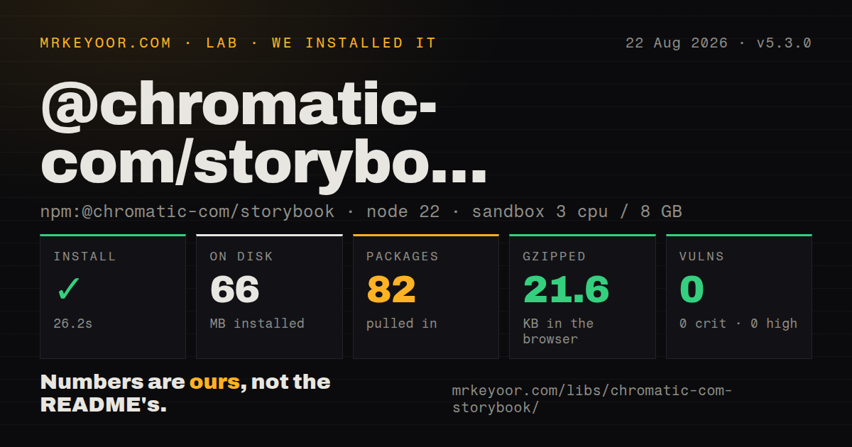
| Install | ✓ · 26.2s | 82 packages on disk · 66 MB |
| Import | ✓ | ESM import works · require() works · CommonJS package with exports map |
| Browser | 21.6 KB | gzipped (60.9 KB minified), bundled with esbuild |
| Types | — | no TypeScript types found |
| Known vulns | 0 | 0 critical · 0 high · 0 moderate · 0 low (npm audit) |
Answers from our run
Does @chromatic-com/storybook install cleanly?
Yes. In a fresh container with an empty cache, npm install @chromatic-com/storybook finished in 26 seconds, leaving 82 packages and 66 MB on disk. npm audit reported no known vulnerabilities.
How much does @chromatic-com/storybook add to a browser bundle?
21.6 KB gzipped (60.9 KB minified) when the whole package is bundled for the browser with esbuild. Importing only part of it is usually smaller.
Does @chromatic-com/storybook work with both ESM and CommonJS?
Yes. Both import '@chromatic-com/storybook' and require('@chromatic-com/storybook') worked in Node 22 in our run. The package is published as CommonJS with an exports map.
Does @chromatic-com/storybook include TypeScript types?
No type declarations were found in our install, so TypeScript users need their own declarations.
@chromatic-com/storybook or chromatic: which should you use?
chromatic: Use the CLI when visual builds belong only in CI and nobody needs the Storybook panel. @chromatic-com/storybook 5.3.0 installed in 26.2 seconds and produced a 21.6 KB gzipped namespace bundle in our sandbox, but every useful visual test still depends on a Chromatic account and hosted build.
When should you not use @chromatic-com/storybook?
Stories cannot leave your network. The README requires a Chromatic account and project access, and the addon sends builds to the hosted service.
Use it if
- Your team already runs Storybook 10.1 or later and wants visual changes reviewed from its addon panel.
- Chromatic should own browser capture, baseline storage, branch comparison, and reviewer approval.
- A story must be checked under several themes, global settings, media modes, or viewport presets.
- Reviewers need a temporary hosted Storybook without building the branch on their own machines.
- Stories cannot leave your network. The README requires a Chromatic account and project access, and the addon sends builds to the hosted service.
- The project uses Storybook 9 or earlier. Package 5.3.0 peers with Storybook 10.1 and later 10.x releases, despite the README's broader 7.6 prerequisite.
- Your runtime is Node 18. The current package declares Node 20 or newer, so this addon would force an environment upgrade.
- You need local or self-hosted screenshot baselines. Loki is a closer fit because this panel cannot compare a fresh baseline while offline.
- Your failures are behavioral or accessibility defects rather than visual changes. Storybook's test runner and addon-a11y target those checks directly.
Setup reality
We installed @chromatic-com/storybook 5.3.0 in 26.2 seconds in a fresh Node 22 container. The install left 82 packages and 66 MB on disk. npm audit found 0 known vulnerabilities. The package itself has 4 direct dependencies, one Storybook peer, and 780 KB unpacked. It is CommonJS with an exports map; both require() and ESM import worked. Our scan found no TypeScript types.
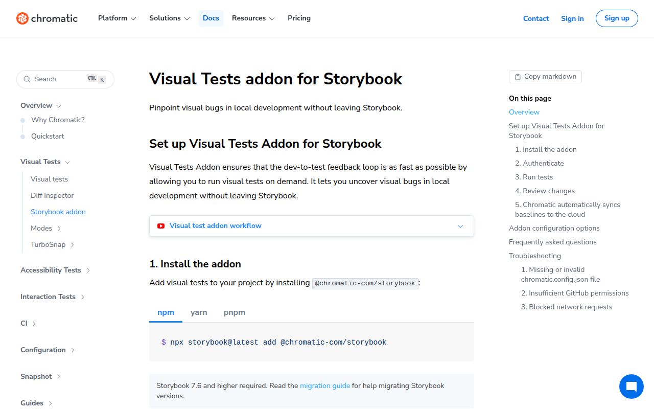
The shortest setup is npx storybook add @chromatic-com/storybook, which installs the addon and updates Storybook config. Manual setup puts the package in .storybook/main.ts under addons. Version 5.3.0 accepts Storybook 10.1 through the listed 10.x prerelease lines and requires Node 20 or newer. Do not rely on the README's old claim that Storybook 7.6 is enough for this major.
A Chromatic account and access to a project are required before the panel can run a visual test. CI also needs the Chromatic project token or project configuration used by the underlying CLI. Keep the token in the CI secret store. Quick Share uploads the built Storybook, so check stories for internal data before creating a link.
Snapshots expose nondeterminism in fonts, animation, random values, live clocks, and network responses. Modes are the current way to vary themes and viewports; the older viewports option is deprecated. Delay waits a fixed number of milliseconds and slows each capture, while ignoreSelectors paints matched regions before comparison. An import-all browser build measured 60.9 KB minified and 21.6 KB gzipped, but application code should not import this addon at runtime.
Patterns
Configure the addon with Storybook CLI install-addon
npx storybook add @chromatic-com/storybookVersion 5.3.0 needs Node 20 or newer and a Storybook version in its 10.1 through 10.x peer range.
Register the addon by hand configure-manually
// .storybook/main.ts
import type { StorybookConfig } from '@storybook/react-vite';

const config: StorybookConfig = {
  stories: ['../src/**/*.stories.@(ts|tsx)'],
  addons: ['@chromatic-com/storybook'],
};

export default config;
The addon goes in Storybook configuration. It should not be imported by the application bundle.
Leave a changing story out of snapshots skip-one-snapshot
export const LiveClock = {
  parameters: { chromatic: { disableSnapshot: true } },
};
disableSnapshot leaves the story visible in Storybook while excluding it from Chromatic capture.
Disable snapshots for a story file skip-component-snapshots
const meta = {
  component: StreamingChart,
  parameters: { chromatic: { disableSnapshot: true } },
};

export default meta;
Metadata parameters apply to every story in the file unless an individual story overrides them.
Test light and dark globals capture-theme-modes
export const ButtonModes = {
  parameters: {
    chromatic: {
      modes: {
        light: { theme: 'light' },
        dark: { theme: 'dark' },
      },
    },
  },
};
Each mode key must match a Storybook global that the preview or a decorator actually reads.
Wait for late rendering delay-capture
export const LoadedProfile = {
  parameters: { chromatic: { delay: 500 } },
};
The value is milliseconds. A 500 ms delay applies to every capture of this story and cannot make random output deterministic.
Ignore selected DOM regions mask-dynamic-region
export const Dashboard = {
  parameters: {
    chromatic: { ignoreSelectors: ['[data-live-clock]'] },
  },
};
Matched elements are painted before comparison, so a selector can hide a real regression if it covers too much of the story.
Adjust pixel sensitivity set-diff-threshold
export const CanvasChart = {
  parameters: { chromatic: { diffThreshold: 0.1 } },
};
The accepted range is 0 to 1. Higher values tolerate more difference, and the documented default is 0.063.
Compare anti-aliased pixels include-antialiasing
export const TypeSpecimen = {
  parameters: { chromatic: { diffIncludeAntiAliasing: true } },
};
The default is false. Turning it on can reveal font changes and can also increase browser-specific noise.
Capture reduced-motion CSS emulate-reduced-motion
export const ReducedMotionMenu = {
  parameters: { chromatic: { prefersReducedMotion: 'reduce' } },
};
This changes the capture's media feature to reduce; the component must still implement the matching CSS or script behavior.
Render the print media query capture-print-css
export const PrintableInvoice = {
  parameters: { chromatic: { media: 'print' } },
};
A print capture does not cover the normal screen rendering, so keep a separate story or mode for that state.
Limit the image to the viewport crop-to-viewport
export const MobileDialog = {
  parameters: { chromatic: { cropToViewport: true } },
};
Use modes for different viewport globals. The older numeric viewports array is deprecated in the current parameter types.
Alternatives
| Package | Registry | Pick it when |
|---|---|---|
| chromatic | npm | Use the CLI when visual builds belong only in CI and nobody needs the Storybook panel. |
| loki | npm | Use it when screenshot capture and baselines must stay local or on infrastructure you manage. |
| @storybook/test-runner | npm | Use it for story and play-function assertions where pixel comparison is beside the point. |
| @storybook/addon-a11y | npm | Use it to catch accessibility violations that a screenshot comparison cannot diagnose. |
More testing guides
pytest · chai · jsdom · vitest · playwright · coverage · the whole shelf →
How this guide is made: grounded in the library's documentation, release notes, changelog, and issue history, on a fixed rubric — not a hands-on install of every release. The 50 most-downloaded entries are additionally install-verified in clean containers. Corrections: contact the desk.